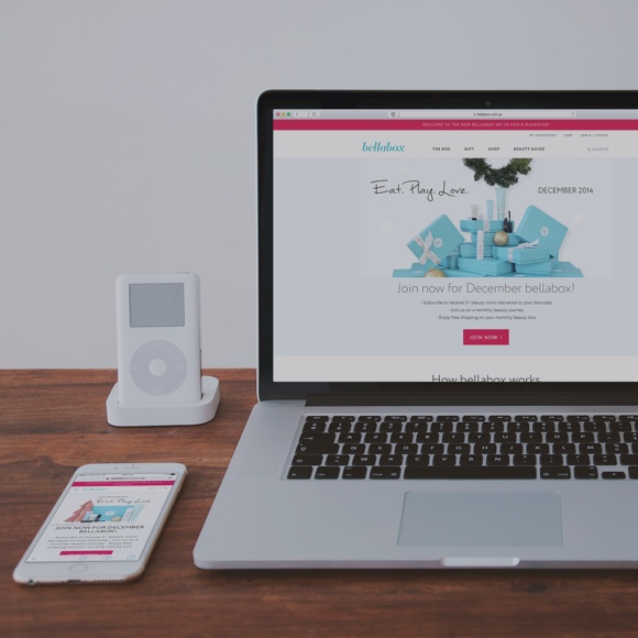
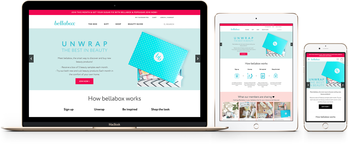
bellabox is an Australian beauty subscription service and online store. Each month, bellabox's subscribers receive a box of beauty samples, specially tailored to match their beauty profile.
Together with a development partner, Minitheory worked with the bellabox team to revamp their website, crafting a seamless experience across their subscription, e-commerce and editorial websites.
As a result, bellabox's subscribers could now easily buy, leave feedback and learn more about their products.
Details
Sep 2013 - Apr 2014
e-commerce website
Services
UX Research
UX Design
Interaction Design
Visual Interface Design
Front-end development
Credits
Mike Chen
Sheldon Cheng
Charmaine Low
Pizza Yap
Zavien Ng
Red Airship (Drupal)

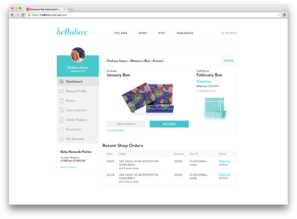
Addressing the biggest pain point: “Where's my box?”
Based on user research and feedback from bellabox's customer support team, the most common question subscribers asked was “where’s my box?”. It was obvious that the biggest painpoint for subscribers was not knowing when their box would arrive that month.
To address this pain point, we created a dashboard where subscribers could view their box’s status – preparing, shipped and an estimated delivery date. We also enhanced the new subscriber experience, ensuring that they get immediate feedback on when their first box will arrive.

Making the beauty profile fun to fill in
Each month, bellabox picks beauty samples for each subscriber’s box based on their preferences indicated in their own beauty profiles. This allows subscribers to get products specifically tailored to their own preferences.
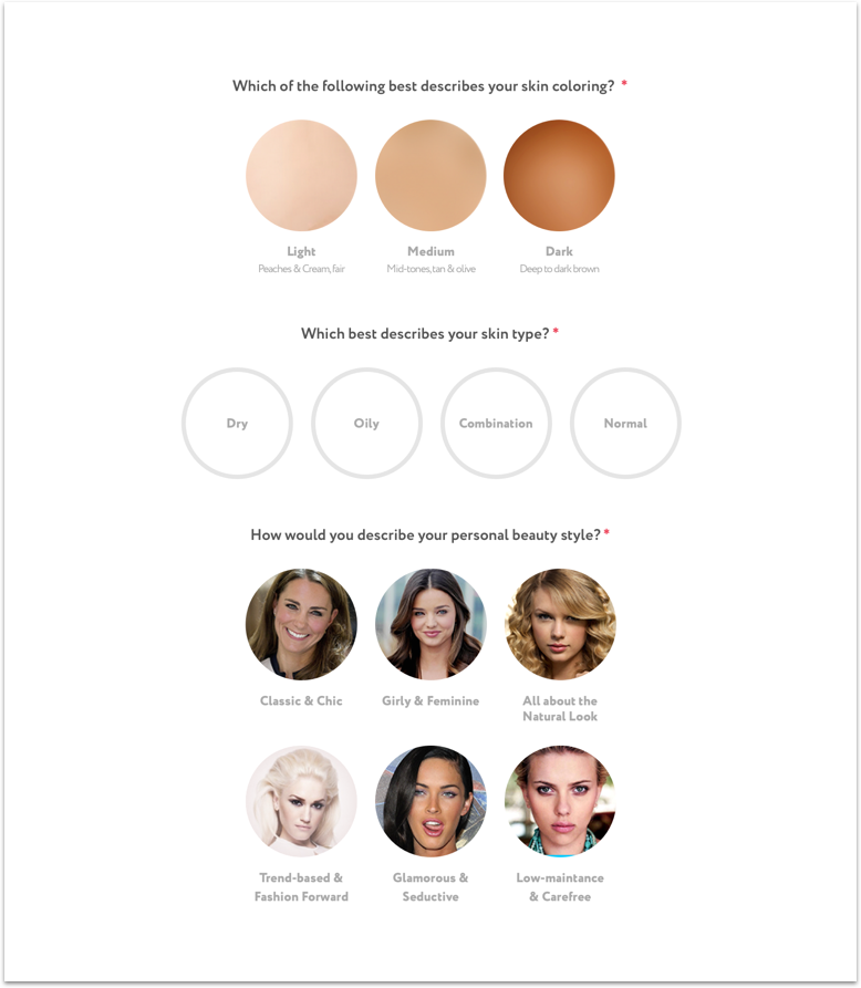
Despite this, more than 2,000 subscribers never filled in their beauty profiles! We identified the plain-looking entry form to be the culprit and set out to make filling in the beauty profile a more fun and engaging experience for subscribers.
We designed a more visual and interactive format for filling in answers and worked with the team to craft clearer questions:

Ensuring visual consistency and saving time with style guides
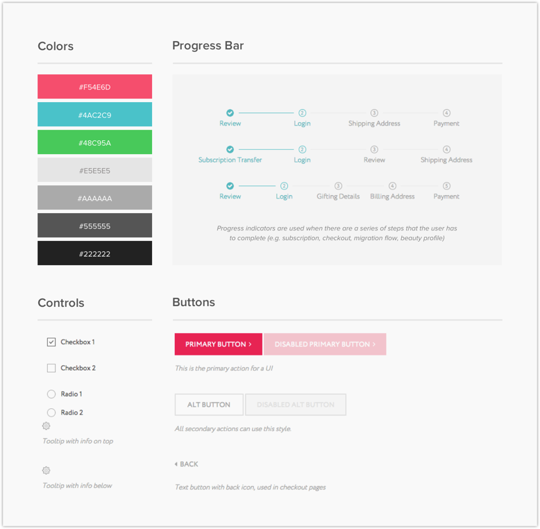
The bellabox website had about 30 distinct page structures and several types of widgets. When we mapped it all out, we knew that we had to design a visual system to maintain consistency throughout the website.
The style guide we prepared for the bellabox team covered common page structures, widgets and components, helping to ensure consistency as new interface elements are added.
Additionally, time savings were achieved as the bellabox team could quickly create new pages from the templates we provided.

Integrating agile development and design
For six months, we worked closely with the bellabox team and a development partner – it was our first time integrating design methods such as user research, ideation and prototyping into an agile workflow.
It was a lot of learning and growing for us, and we were proud to launch the bellabox website in September 2014!


