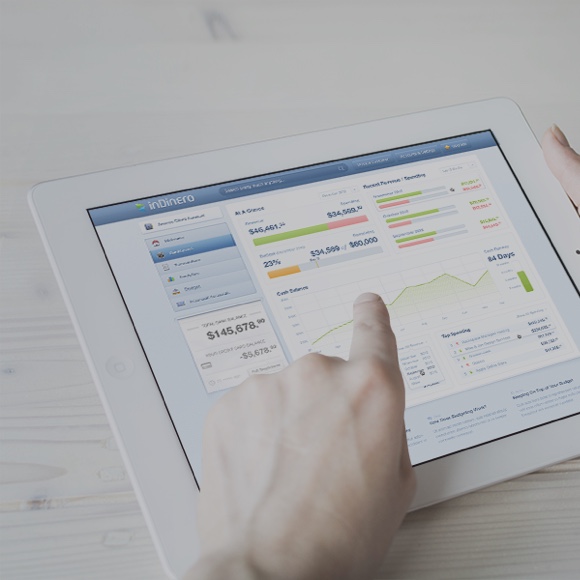
Based in San Francisco, inDinero is a pioneer in the field of financial services that makes managing finances easy for small to medium businesses. The company was one of the most promising startups in the 2011 batch of renowned startup accelerator Y Combinator.
inDinero’s software connects with your bank to pull in bank transactions in real time. Using a revolutionary artificial intelligence system, it then automatically categorises the transactions. Users can also attach receipts to company expenses, saving tremendous amounts of time in the reconciliation process during tax season.
All this reduces the tedium of managing finances so that business owners can concentrate on running their business. This also frees up time for accountants, so they can focus on offering financial advice rather than bookkeeping.
Details
Designed 2011-2013
Financial dashboard
Mobile app
Services
Interface design
Interaction design
Guerilla usability testing
Credits
Mike Chen
Derek Clark
A Change in Strategy
inDinero started off as a real-time financial dashboard for small and medium business owners that allows customers to get a bird’s eye view of their business finances. After two years, they realized this wasn’t enough for their customers who didn’t just need information – they needed someone to take care of all their financial needs so they didn’t have to.
inDinero started to offer in-house accounting services to customers as well. In order to that, they created a financial team that helps customers take care of invoicing and expenses, payroll, onboarding employees, tax filing and much more. A whole suite of accounting tools was needed to automate this process as much as possible. This also benefited customers who had their own accountants. Without these tools, inDinero wouldn’t be able to scale this strategy.
Minitheory was called in to help the interaction design for one of these new tools, the inDinero iPhone app. Besides giving customers mobile access to their dashboard, the iPhone app also allows them to snap and upload receipts directly using the iPhone. This streamlined workflow makes the accountant’s job so much easier.
The Solution
inDinero already had a very good idea of what the app would do. The plan was to launch an iPhone app with three main features:
Dashboard – Get a bird's eye view of finances on the go
View bank transactions – See hte latest transactions
Attach receipts – Snap receipt with iPhone camera and attach them to transactions
Wireframes & Prototyping
We made a high-fidelity prototype using Adobe Fireworks. Using the Invision prototyping tool, we made a clickable prototype that could be loaded onto an iPhone.

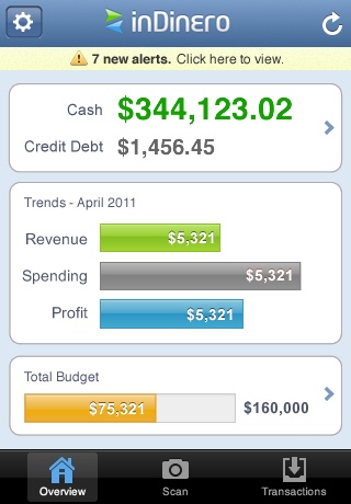
Figure 2a: inDinero's overview prototype

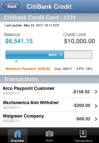
Figure 2b: inDinero's bank information

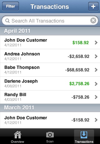
Figure 2c: inDinero's transactions prototype
Guerilla Usability Testing
Luckily for us, there were many nice cafes in the area of San Francisco near inDinero’s office. We got out of the building and took the prototype to cafes, asking customers there to give it a test drive. We iterated quickly on the feedback, tweaking the prototype for two weeks until we were satisfied. We also showed it to as many people as possible: employees, friends, investors, etc., to get their thoughts
Implementation
Minitheory worked with an international team of programmers and designers from the USA, South Africa and Vietnam to build the app. Coordination was pulled off using a mix of Hipchat (an instant messaging software for teams), frequent Skype calls and the use of Pivotal Tracker (a web-based issue tracking software used frequently by Agile developers).
The result: a beautiful app loved by both customers and accountants, with a four-star rating in the App Store.
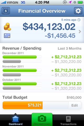

Figure 3a: inDinero's financial overview

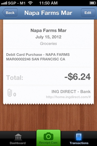
Figure 3b: inDinero's receipt information

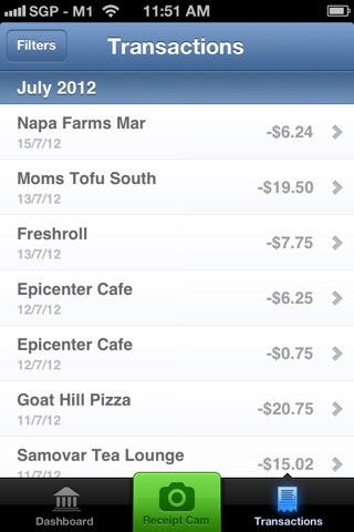
Figure 3c: inDinero's transactions
What We Learned
Keep Prototyping Quick and Dirty
One of the mistakes we made was to make the prototype too high fidelity. While being perfectionist is usually a good thing for a designer, in this case we focused too much effort on making the prototype look good. Instead, we should have concentrated on whether the app was easy to use.
Furthermore, this made tweaking the prototype took more work. We became too attached to our designs! This is the opposite of what you want in interaction design.
You don’t want to commit to a design until you have gone through at least a few cycles of iteration.
