

travelmob
A traveller’s journey from beta to launch
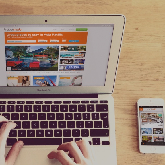
TRAVELMOB.COM
For years, people have had to deal with limited vacation lodging choices usually limited to hotels and holiday homes. What if you could experience what it is like to live like a local while on holiday? Enter the world of online social stay marketplace, travelmob, where users can find truly local accommodation, and even list their own apartments for rent, encouraging a more social travel experience.
Details
Designed in 2013
Website & iOS design
Services
Usability research
Interaction design
Visual interface design
Credits
Mike Chen
Lee Jun Lin
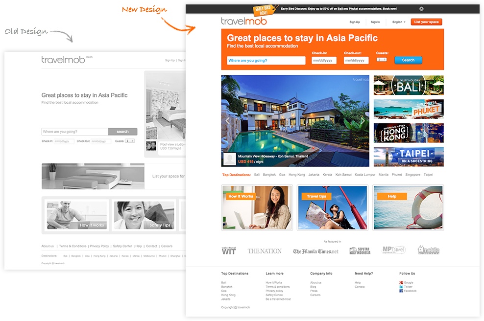
Going from Beta to Launch
travelmob had a beta site up and running, but they were seeking a better user experience and interface in the lead up to their official launch. The challenge: balancing the short timeframe and the amount of work that needs to be done to their existing site, while improving overall usability.

The new website was designed to encourage visitors to browse and discover accommodations beyond that which they were searching for.
Tackling the Key User Flows
In order to prioritize the work that needs to be done, we evaluated the key user flows of the beta site, that of a Guest looking for accommodation, and a Host looking to list his apartment.
Encouraging Discovery
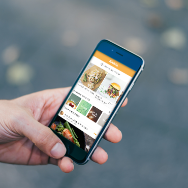
As a Guest, we wanted to know what was key in determining if you would stay at a local’s home? From travelmob’s user feedback, users were apprehensive about making bookings through the website. To alleviate this, we improved the showcase of accommodations on the homepage; and made the call to action a lot more prominent, encouraging users to discover the potential accommodation types available on the website.
The introduction of the banner section also allowed curated accommodations and introduced a space for showcasing promotions and deals, improving the reach and appeal to browsing and serious users alike.
The introduction of a cleaner interface to the search experience, with improved typography and colors, allowed users to focus on the listing results. The experience tags feature from travelmob has also been designed in a less intrusive manner where users can quickly discover the kind of experiences an accommodation offers.

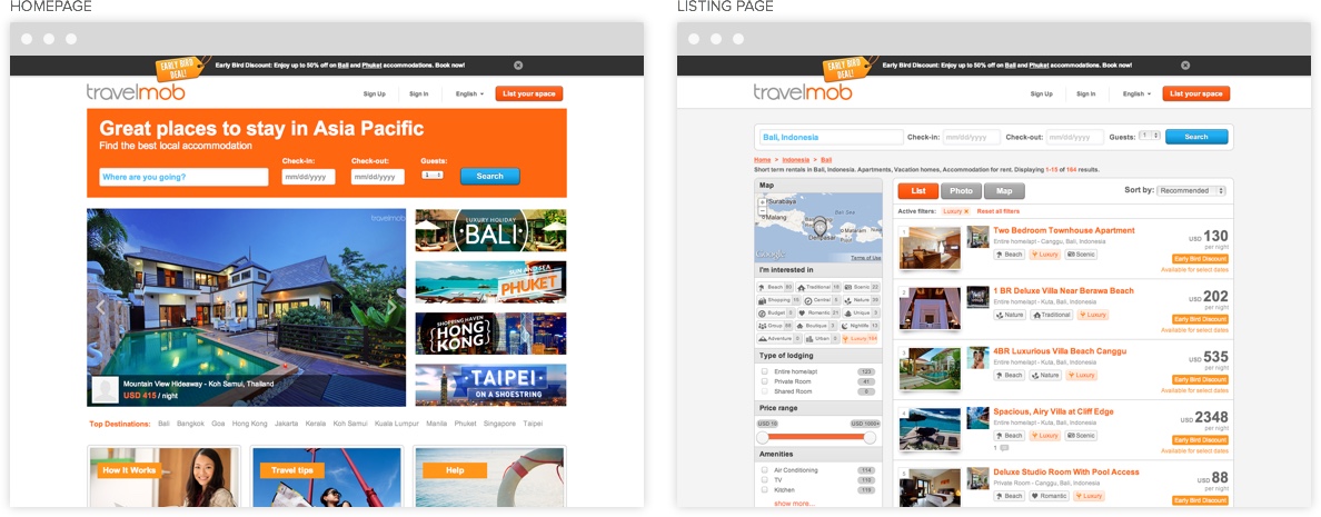
A new search experience was introduced, allowing users to focus on the listings and quickly find what they were looking for.
An Easier Listing Experience
For Hosts, the need was in streamlining the experience of listing their accommodations on the website. The beta site had a single page form and users were dropping off and not completing the process. To balance the numerous fields they were required to input, we went with a step approach, breaking the form into 3 key steps, and conveying to users where they were at in the sign up process. This made the task less daunting, and users were able to gauge with the help of the step indicator, how far they were into completing the process.
The Outcome
Prioritising Design Needs
When approaching a project, there is always a tendency to execute on every feature and design change seeking a perfect product strategy. In reality, that approach is often not possible due to resource constraints. As such, prioritizing the design needs based on key user behaviors and flows will help address the larger and more important usability issues first which are key to the business.
Close Collaboration
The key to being able to launch in a short timeline was working closely with the Product and Engineering team at travelmob. As a design team, we were able to leverage their domain knowledge and experience in coming up with the solutions.
Constant communication and feedback was key to launching a product that clients and their customers are happy with.